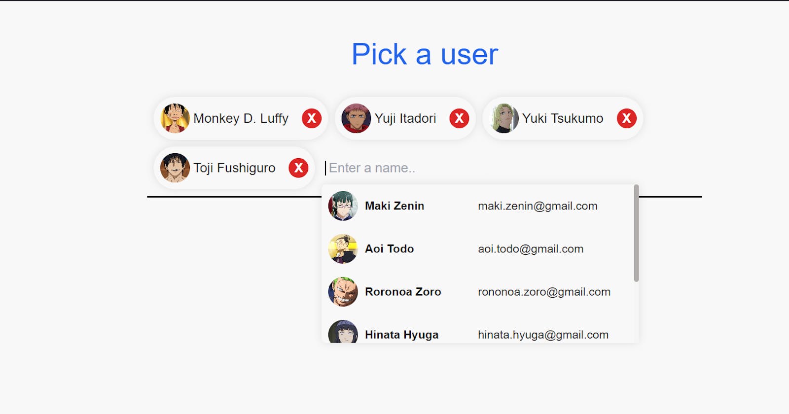


What are we building ?
Go visit site at Chip component with search filter.
Project setup
Create a new vite project run
npx create-vite@latest my-vite-app
Select vite + typescript.
Now remove all contents from App.tsx and index.css.
Let's get coding
First let's create our users.
Create a folder named lib and inside it create a file name data.ts
The way we can represent our users is by creating an array of objects. Here each object will represent a user. In typescript we should define the type of this user object for that we write
export interface User {
  id: number; // Attribute id is of type number
  name: string;
  email: string;
  avatar: string;
}
// interface provide a mechanism for describing the expected structure of an object.
/* Understand it as User is a custom type defined by us which will
   only take attribute as we have defined them here.
*/
Now we can create a array of objects name user which will be of type User[] i.e. a list of elements of type User such as
export const users : User[] = [
  {
    id: 0,
    name: "Monkey D. Luffy",
    email: "luffy@gmail.com",
    avatar: "https://i.pinimg.com/564x/23/e4/e7/23e4e7aa8e7a9e2dbc75fece9d77fc99.jpg",
  }]
//Here users is an array of objects of type User defined above.
//Add more of such objects.
In App.tsx
//div1
<div className="w-full h-full sm:w-[42rem] sm:max-h-[20rem] flex flex-wrap justify-start items-center gap-2 p-2 border-b-2 border-black">
    //div2
    <div className="relative">
        <input
          type="text"
          className="pl-1 outline-none bg-[#f9f8f8] rounded-sm"
          placeholder=" Enter a name.."
        />
        <!-- div3 -->
        <div
          className="w-[24rem] max-h-[12rem] absolute top-8 z-10 bg-[#f9f8f8] rounded-md custom-shadow overflow-y-scroll overflow-x-hidden"
        >
        </div>
    </div>
</div>
Here I create a div1 it is a parent div. Then created a div2 that is relative and is the same size as input so that the div3 can be place just below the input field with position absolute. Here is a good resource to learn position.
Now we need to populate our div3 with our users. It is a good practice to use separate component for this purpose. The idea is that we will map through users from data.ts and return a component for each of them.
Create a new file UserComponent.tsx with the following props and tsx.
interface UserComponentProps {
  id: number;
  name: string;
  email: string;
  avatar: string;
}

const UserComponent = ({id, name, email, avatar} : UserComponentProps) => {
  return (
      <li key={id} className='flex cursor-pointer justify-between items-center text-sm py-2 px-2 hover:bg-[#f0ecec]'>
        <div className='w-1/2 flex justify-start items-center gap-x-2'>
            <img src={avatar} alt="Profile Picture" className='rounded-full w-9 h-9 object-cover'/>
            <p className="font-semibold">{name}</p>
        </div>
        <div className="w-1/2 flex justify-start">
            <p className="text-center">{email}</p>
        </div>
    </li>
  )
}

export default UserComponent
Here we have taken in few props that we will pass from App.tsx. These props are of type UserComponentProps now we could have simply used the User interface we designed in data.ts but we need to pass few more props here.
Once done we can now populate the div3 in App.tsx we will map through users and pass the UserComponent with these props.
{users.map((user, index) => (
  return (
    <React.Fragment key={index}>
       <UserComponent id={user.id} name={user.name} avatar={user.avatar} email={user.email} handleSelect={handleSelect}/>
    </React.Fragment>
  );
))}
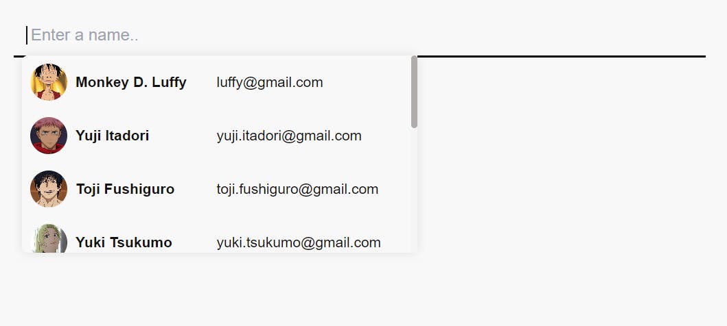
Now you should see something like this
Let's recall some functions :
onFocus = executes when the input field is on focus
onBlur = executes when the input is out of focus
Create a new state name toggleOptions of type boolean and set it's value to false.
type Options = boolean | ""; //Keep this function at the top level
const [toggleOptions, setToggleOptions] = useState<Options>(false);
Now replace the className of div3 with this modified one
className={`w-[24rem] max-h-[12rem] absolute top-8 z-10 bg-[#f9f8f8] rounded-md custom-shadow overflow-y-scroll overflow-x-hidden ${
            !toggleOptions && "hidden"
 }`}
Here className attribute is assigned to a string that uses template literal (``) for conditional rendering i.e if toggleOptions return falsy value then it evaluates to true "hidden" class is added which does not render the component whereas if toggleOptions return truthy value then it evaluates to false so the "hidden class is not added and the component is rendered".
Now we need to switch the value of toggleOptions when the input is on or off focus. To achieve this we will use the onFocus and onBlur event handler. It's simple we will write two functions that are executed by the event handler when the respective events are triggered.
//Add these functions before the return statement
const handleBlur = async() => {
    setToggleOptions(!toggleOptions);
  };

  const handleFocus = async() => {
    setToggleOptions(!toggleOptions);
 };

//Add these event handler along with these functions to the input field
<input
  type="text"
  className="pl-1 outline-none bg-[#f9f8f8] rounded-sm"
  placeholder=" Enter a name.."
  onFocus={handleFocus}
  onBlur={handleBlur}
/>
Amazing now if you click in the input the our user option component is rendered and when you click somewhere else it is not rendered.
Let's wrap up for now I will write about filtering the users when as you type a name and also adding and removing the chip component.